Senior Product Designer

Achille Zouaoui

Design Systems · Accessibilité · Produits complexes

Expert dans la structuration et la gouvernance de Design Systems — de la conception des composants à leur adoption équipe. Expérience sur des produits multi-acteurs à forts enjeux business. J'utilise l'IA générative et agentique pour accélérer la conception, la documentation et la collaboration design ↔ dev.

AI-Augmented Design
Figma AI Figma Make Figma MCP × Claude Code Excalidraw MCP Claude GPT
Design Systems
Atomic Design Design Tokens Gouvernance Zeroheight Slots & Auto-layouts Design ↔ Code sync
Accessibilité
WCAG AA/AAA Stark Lighthouse Accessibilité visuelle & motrice
Leadership & Culture Design
Mentorat designers Ateliers UX Collaboration produit/dev Communication décisionnelle
UX Produits complexes
Parcours multi-acteurs Dashboards métiers UX Research Heatmaps Insights data-driven

WOOP

Lead Design System — Governance, AI Workflows & Scalable Components

Context

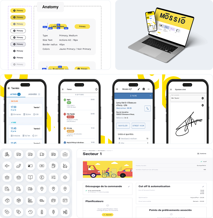
WOOP is a delivery orchestration SaaS platform used by major retailers including Auchan, Decathlon, and Leroy Merlin. With a growing product and engineering team, the platform lacked a structured design foundation — leading to inconsistent UI, duplicated components, and slow delivery cycles. A scalable, governed Design System was urgently needed.

My Role

Lead Product Designer — sole owner of the Design System initiative. I drove strategy, architecture, documentation, and adoption across all product teams from inception to production.

Approach & Methods

  • Architected a full Design System using Atomic Design principles — atoms, molecules, organisms, templates
  • Defined and managed Design Tokens (color, typography, spacing, elevation) for consistent multi-platform theming
  • Published comprehensive documentation on Zeroheight with governance rules and contribution guidelines
  • Integrated AI tools (Figma AI, Figma Make, Figma First Draft, Claude, GPT) to accelerate design production and UX analysis
  • Connected DataDog analytics for UX monitoring — built automated reporting dashboards for product insights
  • Led co-design workshops and alignment sessions with product owners and engineers
  • Defined WCAG AA/AAA accessibility standards across all components

Key Contributions

  • Built 50+ reusable, accessible components with documented variants and usage rules
  • Established design governance process — review cycles, contribution workflow, versioning
  • Ran design system onboarding workshops for product and dev teams
  • Shifted the design culture from ad-hoc UX to structured, scalable practices

Impact & Results

80% User journeys aligned with the design system
40% Reduction in duplicate UI components
25% Faster front-end development
25% Faster design production with AI-assisted workflows
10% Faster back-end dev via clarified UX rules
<18 mo 80% design system adoption across product teams

Tools

Figma Figma AI Figma Make Zeroheight Design Tokens Atomic Design DataDog Claude GPT Stark Jira

Mockups and additional details available on request.

WOOP Design System - Components and Guidelines

Oney Bank

Multi-Actor Loan Management Platform — Customers, Merchants & Bank Agents

Context

Oney Bank needed to digitise and streamline its end-to-end after-sales loan management journey. The solution had to serve three distinct actor types — customers, merchants, and internal bank agents — each with specific workflows, permissions, and information needs, all within Oney's established design system.

My Role

Product Designer — embedded within a cross-functional team of 10. I owned the UX across all three actor interfaces, facilitating daily design reviews in English with Oney and FintechOS teams.

Approach & Methods

  • Mapped transactional workflows and edge cases for each actor type
  • Conducted user needs analysis and provided strategic UX recommendations under business and technical constraints
  • Designed scalable dashboards tailored to each role (customer self-service, merchant management, agent back-office)
  • Integrated existing Oney Design System components throughout all interfaces
  • Coordinated with external technology partner FintechOS for seamless implementation
  • Ran daily design reviews in English across Oney and FintechOS stakeholders

Key Contributions

  • Designed a customer-facing portal for loan information, personal data management, and after-sales requests
  • Built a merchant portal for transaction and contract management
  • Created agent back-office screens for loan monitoring and processing
  • Produced transactional email templates aligned with Oney brand guidelines
  • Ensured full WCAG AA accessibility compliance across all interfaces

Impact

  • Delivered a fully digitised, role-specific after-sales journey — eliminating manual processes
  • Improved experience consistency across all three user actors within a single platform
  • Strengthened Oney Design System adoption through practical, production-ready application

Tools

Figma FigJam Oney Design System Jira Zeplin Stark

Mockups and additional details available on request.

Oney Bank – Loan management portal

BRED Bank

Internal Banking Tool Redesign — Complex Business Rules & UX Standardisation

Context

BRED Banque Populaire required a complete redesign of an internal transfer management tool used by banking advisors daily. The existing system was cluttered, inconsistent, and poorly adapted to complex business rules — slowing down operations and generating user frustration.

My Role

Product Designer UX/UI — collaborating closely with UX Researcher, UI Designer, Product Owner, Product Manager, and Head of Product to deliver an end-to-end redesign from discovery to handoff.

Approach & Methods

  • Facilitated discovery workshops to capture user needs and complex business rules
  • Led co-design sessions from the earliest design phases, involving stakeholders and end users
  • Translated dense business logic into clear, navigable UX flows and dashboards
  • Delivered iterative wireframes and interactive prototypes validated through user feedback loops
  • Built a reusable UI kit to standardise visual components and ensure design consistency
  • Applied Design System principles throughout — contributing to BRED's evolving component library

Key Contributions

  • Redesigned core transfer management screens — improved information hierarchy and task efficiency
  • Created dashboards adapted to advisor workflows with clearer data visualisation
  • Delivered a structured UI kit ensuring visual consistency and reducing design debt
  • Facilitated alignment between business, product, and engineering through shared design artefacts

Impact

  • Significantly improved user experience for banking advisors — reduced task completion time
  • Standardised UI components across the internal tooling ecosystem
  • Established a repeatable design process for future internal tool projects

Tools

Figma FigJam Zeplin Atomic Design Design System Live Design

Mockups and additional details available on request.

BRED – Internal transfer management tool

APRIL Assurance

Subscription Journey Redesign — Research-Driven UX for Insurance Brokers

Context

APRIL Assurance, a leading insurance distribution group, needed to overhaul its broker subscription portal. The existing journeys were complex, error-prone, and slowing down brokers' ability to complete insurance subscriptions efficiently — directly impacting conversion and professional adoption.

My Role

Product Designer — collaborating with product, business, and development teams to redesign the end-to-end subscription experience, from initial research through validated production-ready prototypes.

Approach & Methods

  • Conducted user research — structured interviews with brokers and internal business stakeholders
  • Synthesised insights to identify critical friction points and prioritise redesign scope
  • Facilitated co-design workshops with product and business teams to align on solutions
  • Designed end-to-end subscription flows — from product selection to contract confirmation
  • Delivered iterative wireframes and interactive Figma prototypes, refined through multiple testing cycles
  • Ran usability tests to validate assumptions and iterate before development handoff

Key Contributions

  • Redesigned the full subscription journey for professional brokers — simplified multi-step flows
  • Reduced cognitive load through clearer information architecture and progressive disclosure
  • Created reusable form components and design guidelines for consistent subscription patterns
  • Aligned product, business, and dev teams through shared design artefacts and documentation

Impact

  • Improved broker satisfaction and experience quality — validated through user testing feedback
  • Reduced subscription time and operational errors for professional users
  • Increased portal adoption by broker professionals post-launch

Tools

Figma FigJam User Interviews Prototyping Usability Testing Live Design

Mockups and additional details available on request.

APRIL – Subscription journey redesign

Browse projects